Bitcoin Rainbow Chart (Old)

Here is the new Bitcoin Rainbow Chart

Bitcoin Rainbow Price Chart
(The original chart)
Maximum Bubble TerritorySell. Seriously, SELL!FOMO intensifiesIs this a bubble?HODL!Still cheapAccumulateBUY!Basically a Fire SaleBitcoin is dead
Feel like buying Bitcoin? Go to Binance . Without KYC: MEXC

Feel like buying? Sign up at Binance and support this site

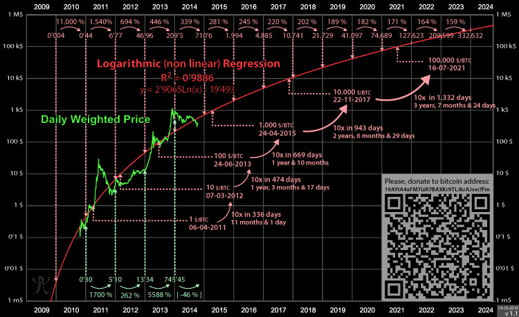
The Rainbow Chart is not investment advice! Past performance is not an indication of future results. The Rainbow Chart is meant to be be a fun way of looking at long term price movements, disregarding the daily volatility “noise”. The color bands follow a logarithmic regression (introduced by Bitcointalk User trolololo in 2014), but are otherwise completely arbitrary and without any scientific basis. In other words: It will only be correct until one day it isn’t anymore. Btw…here is the Ethereum Rainbow Chart

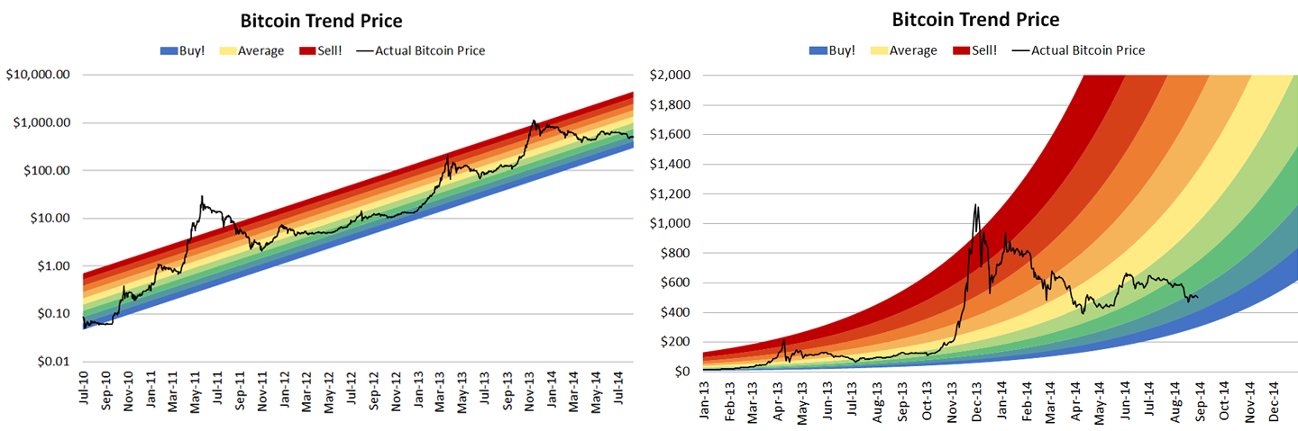
For reference: These were the original charts from 2014.

The rainbow chart on this site combines them.

Original Rainbow Chart from Reddit User azop (without logarithmic regression)
Original logarithmic regression from Bitcoin Talk user trolololo that is now used for the Rainbow Chart

Comparison Tools

More blockchaincenter.net Tools

Author: Rohmeo
Follow me on Twitter: @rohmeo_de - blockchaincenter.net - Permabull - Tweets mostly crypto charts & data porn (aka. Bitcoin Rainbow Rainbow Chart guy) - Host KONSENS & NONSENS Podcast
Disclaimer: Der Handel mit Kryptowährungen birgt ein hohes Risiko und kann bis zum Totalverlust des eingesetzten Kapitals führen. Keine der hier aufgeführten Informationen sind als Anlageberatatung zu verstehen. Alle genannten Kurse sind ohne Gewähr. Bitte beachten Sie dazu auch den den Haftungsausschluss im Impressum.
Mit markierte Links sind 'Affiliate-Links', die uns dabei helfen diese Inhalte kostenfrei und ohne Werbebanner anbieten zu können.